Home 9 Grids 9 The Art of Type: How Designers Like Jan Tschichold and Paul Renner Changed Typography

The Art of Type: How Designers Like Jan Tschichold and Paul Renner Changed Typography

by | Jan 31, 2025 | Grids, History, Typography | 0 comments

Typography is one of those design disciplines that appears simple but hides a profound complexity beneath its surface. After all, it’s just letters on a page—or so some might think. In truth, the artistry and science of type have been shaped and reshaped by a handful of extraordinary visionaries, whose work has permanently altered how we communicate. Our journey will soon take a brief look into the contributions of three such luminaries: Jan Tschichold, Paul Renner, and David Carson. From Tschichold’s rigid yet liberating grid systems to Renner’s iconic Futura and Carson’s rule-breaking chaos, we’ll explore how these designers didn’t just change typography—they redefined visual culture itself.

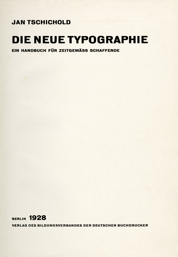
Let’s start with Jan Tschichold. A name synonymous with order and precision, Tschichold was a key figure in the development of modern typography. His book, *Die neue Typographie* (The New Typography), published in 1928, laid out principles that embraced clarity, functionality, and a strong sense of structure. He believed in stripping away the unnecessary—no more ornate flourishes or decorative elements. Instead, he championed sans-serif typefaces and the use of asymmetrical layouts organized by invisible grid systems. His philosophy was not just about aesthetics but about making design serve its ultimate purpose: communication. As Tschichold famously said, “Perfect typography is certainly the most elusive of all arts. Sculpture in stone alone comes near it in obstinacy.”

Perfect typography is certainly the most elusive of all arts.”

Jan Tschichold
Paul Rand (left) and Brockmann (right) during a work session at IBM in the 1960s

Jan Tschichold. Title page of Die neue Typographie (The New Typography), 1928. Published by Bildungsverband der deutschen Buchdrucker, Berlin.

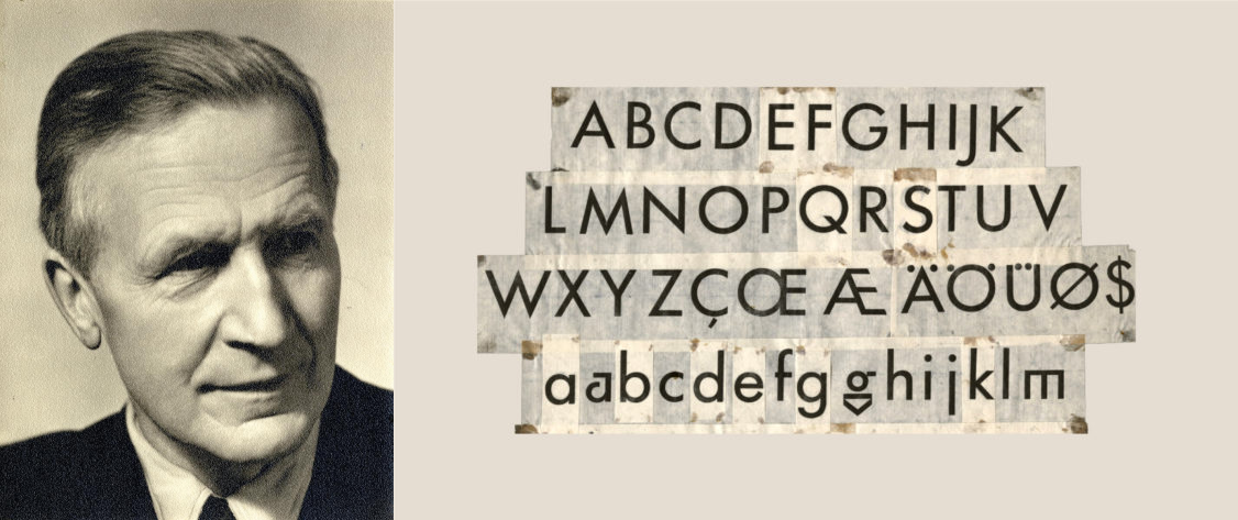
If Tschichold was the architect of the typographic grid, Paul Renner was its builder. Renner’s contribution to design came in the form of a typeface that’s so ubiquitous today, it’s easy to forget how revolutionary it was: Futura. Released in 1927, Futura was the embodiment of the Bauhaus movement’s ideals—geometry, simplicity, and functionality. With its clean lines and almost mathematical precision, Futura rejected the calligraphic influences of earlier typefaces and instead pointed towards a modern, machine-made future. Renner wasn’t just creating a font; he was making a statement about where society was headed. His work bridged the gap between artistry and industry, proving that type could be both beautiful and utilitarian.

Perfect typography is certainly the most elusive of all arts.”

Jan Tschichold
Paul Rand (left) and Brockmann (right) during a work session at IBM in the 1960s

Portrait of the typographer Paul Renner by Eduard Wasow circa 1927

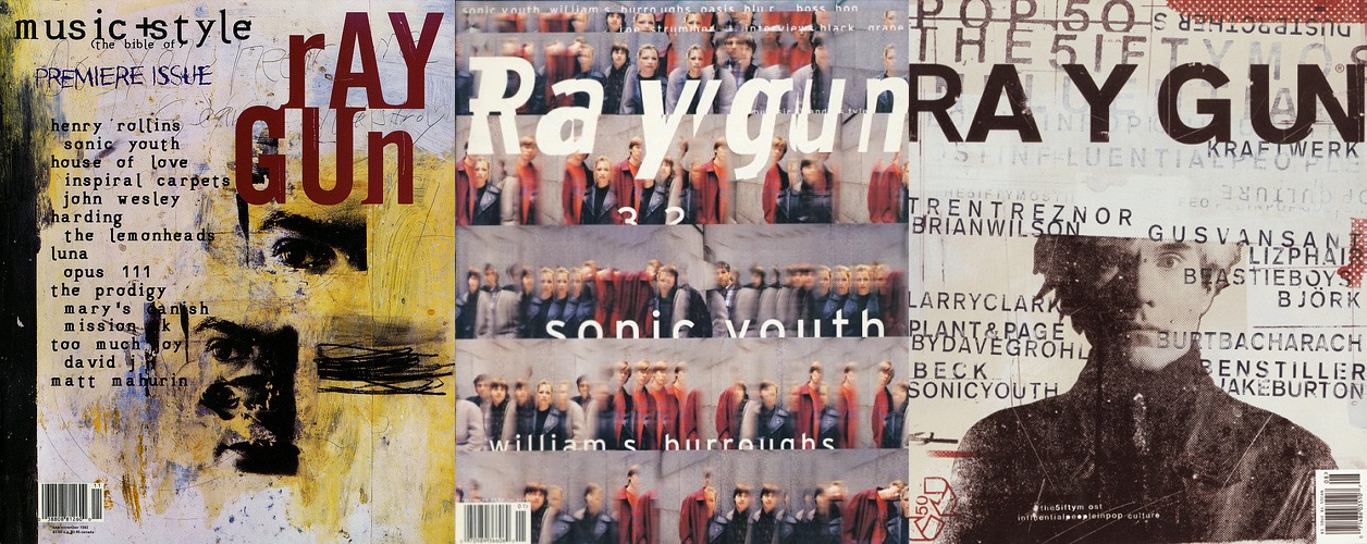
And then there’s David Carson. If Tschichold and Renner are the yin of structure and precision, Carson is the yang of rebellion and chaos. Famous for his work on *Ray Gun* magazine in the 1990s, Carson turned the rules of typography on their head. Letters overlapped, collided, and sometimes seemed entirely illegible—and yet, his work was undeniably compelling. Carson believed that emotion should lead design, even if that meant bending (or breaking) the rules. In his words, “Don’t mistake legibility for communication.” While some critics argued that his work sacrificed clarity, others saw it as a fresh and provocative approach to visual storytelling. Carson’s chaotic style reminds us that typography isn’t just about rules; it’s about resonance and connection.

Don’t mistake legibility for communication.”

David Carson
Paul Rand (left) and Brockmann (right) during a work session at IBM in the 1960s
Raygun magazine cover design art direction by David Carson. From left to right – Premiere issue, November 1992 – Issue 7, June/July 1993 – Issue 58, August 1998
What ties these designers together, despite their wildly different approaches, is their understanding that typography is more than just a tool. It’s a form of expression, a way to convey not only information but also emotion and intention. Tschichold gave us the grid as a guide, Renner gave us type that felt timeless, and Carson reminded us that rules are made to be broken. Together, they expanded the boundaries of what typography could be. If you’re a designer, a writer, or just someone who’s ever admired a beautifully crafted typeface, take a moment to appreciate the lineage that brought it to life. Typography is not static; it’s alive, evolving with every designer who dares to question, refine, or completely upend what came before.

Resources

“The New Typography” by Jan Tschichold A seminal work that lays out the principles of modern design and typography. “Paul Renner: The Art of Typography” by Christopher Burke A detailed biography of Renner and his groundbreaking work. “David Carson: Trek” by David Carson A visual feast of Carson’s innovative and experimental designs. “Thinking with Type” by Ellen Lupton A modern classic that’s both accessible and insightful for designers at all levels. “Stop Stealing Sheep & Find Out How Type Works” by Erik Spiekermann A humorous yet informative guide to understanding typography.
Share this...

0 Comments

Submit a Comment

Your email address will not be published. Required fields are marked *

This site uses Akismet to reduce spam. Learn how your comment data is processed.